ML-Ch2-P2-End to End Machine Learning Project
[Machine Learning blog series](tags/Machine Learning)
Introduction
Welcome to this exciting chapter Again!
Step 3: Explore and Visualize the Data to Gain Insights
- make a copy of the original dataset so we can revert to it afterwards
Visualizing geographical data
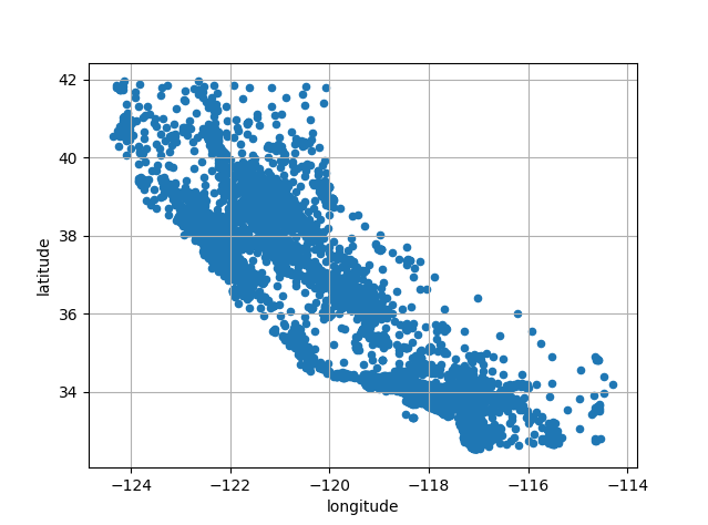
Since the dataset includes geographical information, it is a good idea to create a scatterplot of all the districts to visualize the data.
1 | housing.plot(kind='scatter', x='longitude', y='latitude', grid=True) |
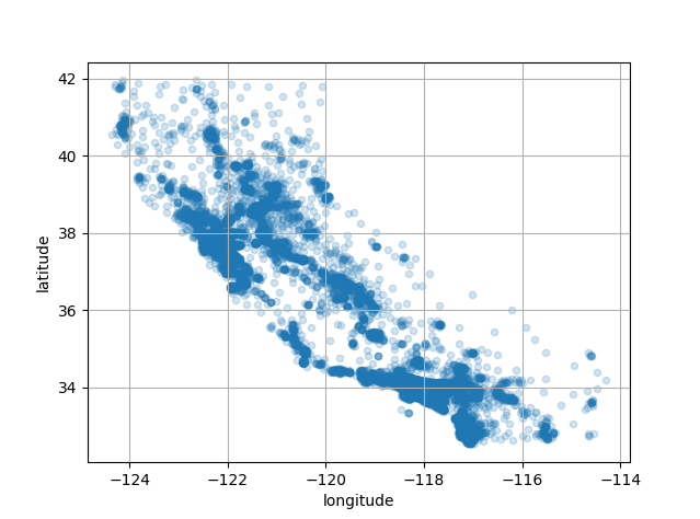
1 | housing.plot(kind='scatter', x='longitude', y='latitude', grid=True, alpha=0.2) |
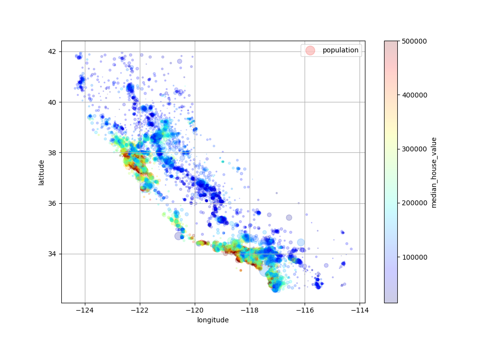
Next, let’s look at the housing prices. The radius of each circle represents the district’s population (option s), and the color represents the price (option c). We can use a predefined color map (option cmap) called jet, which ranges from blue (low values) to red (high prices).
1 | housing.plot(kind='scatter', x='longitude', y='latitude', grid=True, |
Look for corrections
Experiment with attribute combinations
Step 4: Prepare the Data for Machine Learning Algorithms
Step 5: Select a Model
Step 6: Fine-Tune the Model
Step 7: Present the Solution
Step 8: Launch, Monitor, and Maintain the System
ML-Ch2-P2-End to End Machine Learning Project
https://emilypeng2017.github.io/2025/01/09/ML-Ch2-P2-End-to-End-Machine-Learning-Project/